Side project: Read later web app
2024-4-23
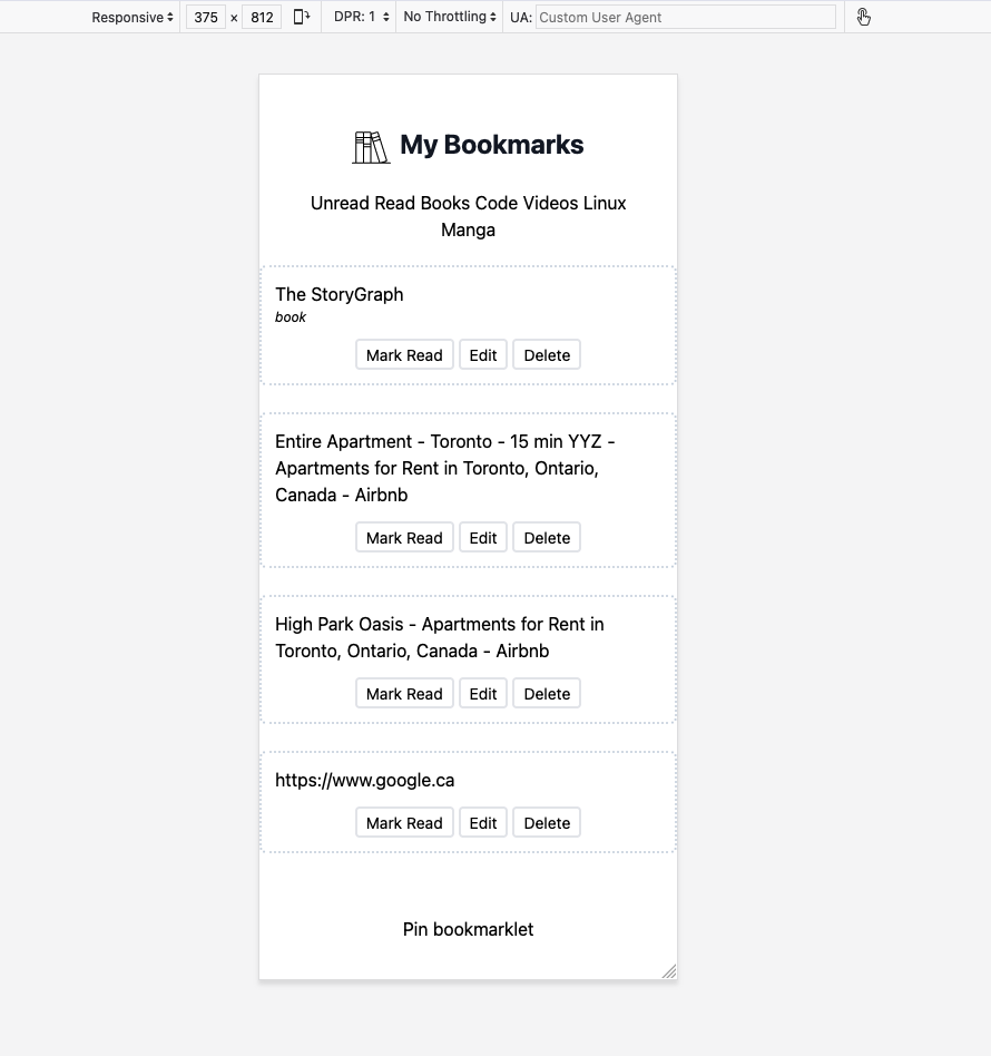
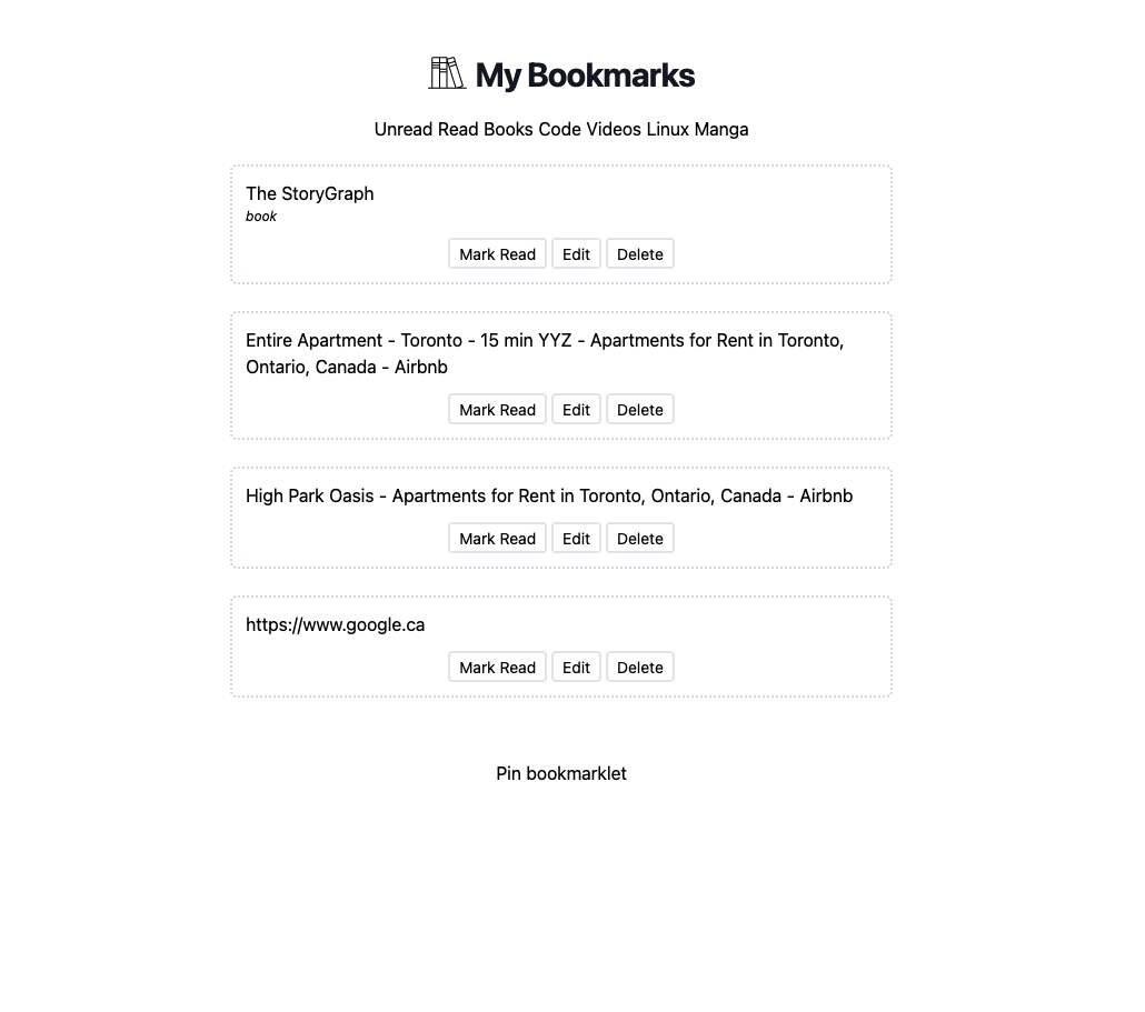
- Updated styling for better reading on my iphone mini 12. I use my reading list on my phone, ipad and a 27” desktop screen. Hopefully this will be nice across all 3. (I tested on the phone and desktop screen) Thinking about responsive design is definitely a thing! :) Tailwind made this incredibly easy. A little too easy. What’s the catch they wonder … ?!


2024-4-21
- Added tailwind yesterday before doing a bit more styling. I haven’t used it on a project yet personally but wow what a difference it seems to be compared to targeting tags with classes or ids in a separate stylesheet file. It’s nice to be able to see styles that target individual elements exactly and the concise-ness of the naming also feels good. I’ll have to extract thymeleaf fragments at some point for reusability.
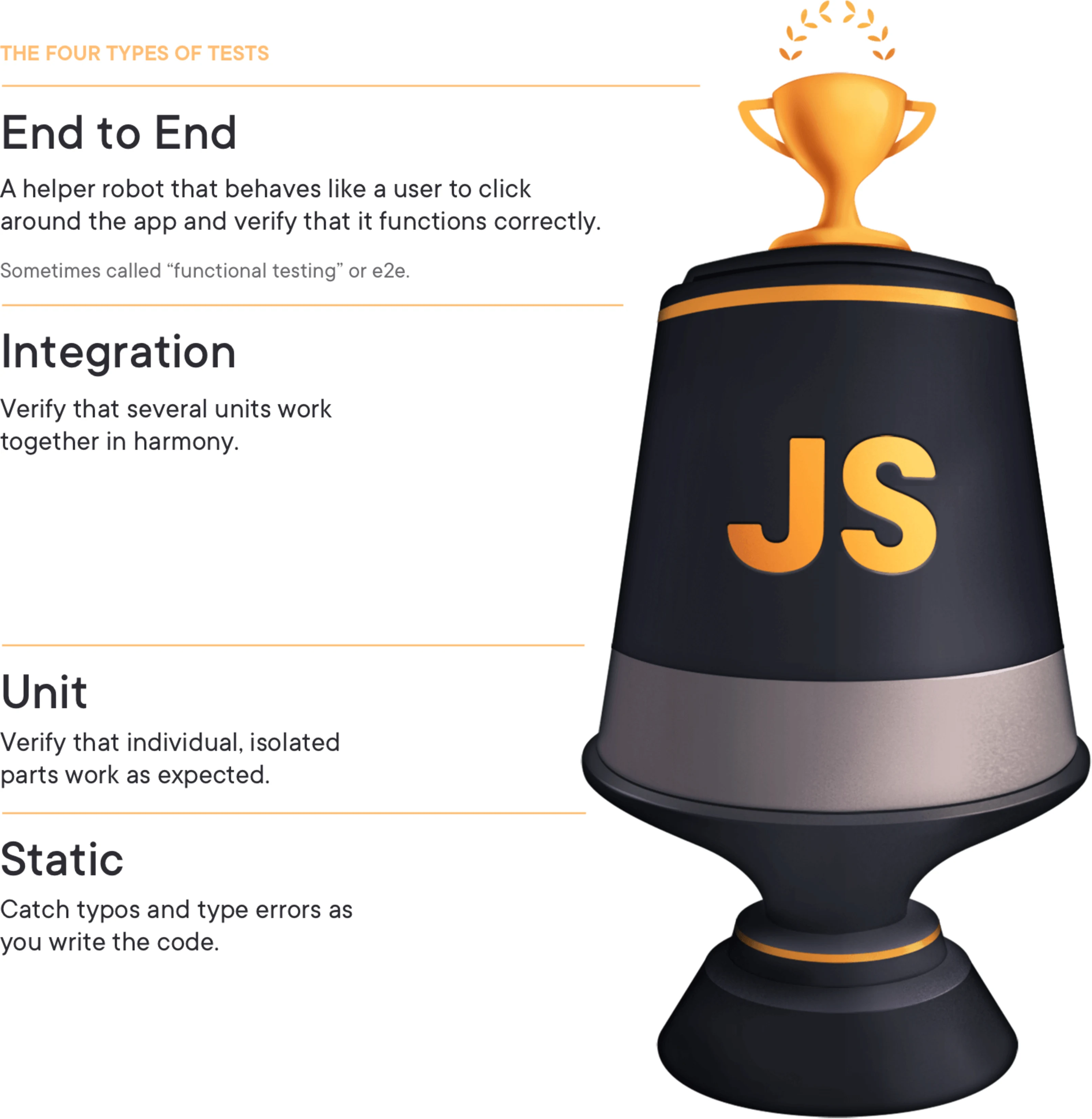
- I will also say I have a couple integration tests that for adding and deleting bookmarks that have already be worth writing. Seems like the test trophy is the right way to think about spending test energy. Lots of integration tests, so you know you’re testing real system components together, a few end-to-end tests checking the most important application workflows, and then some smaller number of unit tests around particularly tricky application logic.
- 100% test coverage is hard and might not be a good goal. Find the tests that matter and create real safety

2024-3-11
- Security rules should be default deny with specific allows. I learned this when I discovered the h2 console was public because I forget to make a specific deny rule for it. We shouldn’t have to remember all our protected urls and have to be really careful this way. Nothing is available by default except for a few public things like the login, and signup pages.
- Websites have public pages and protected pages. Even on public pages there may be controls that only logged in users can see. It’s probably a good idea to think about this up front.


